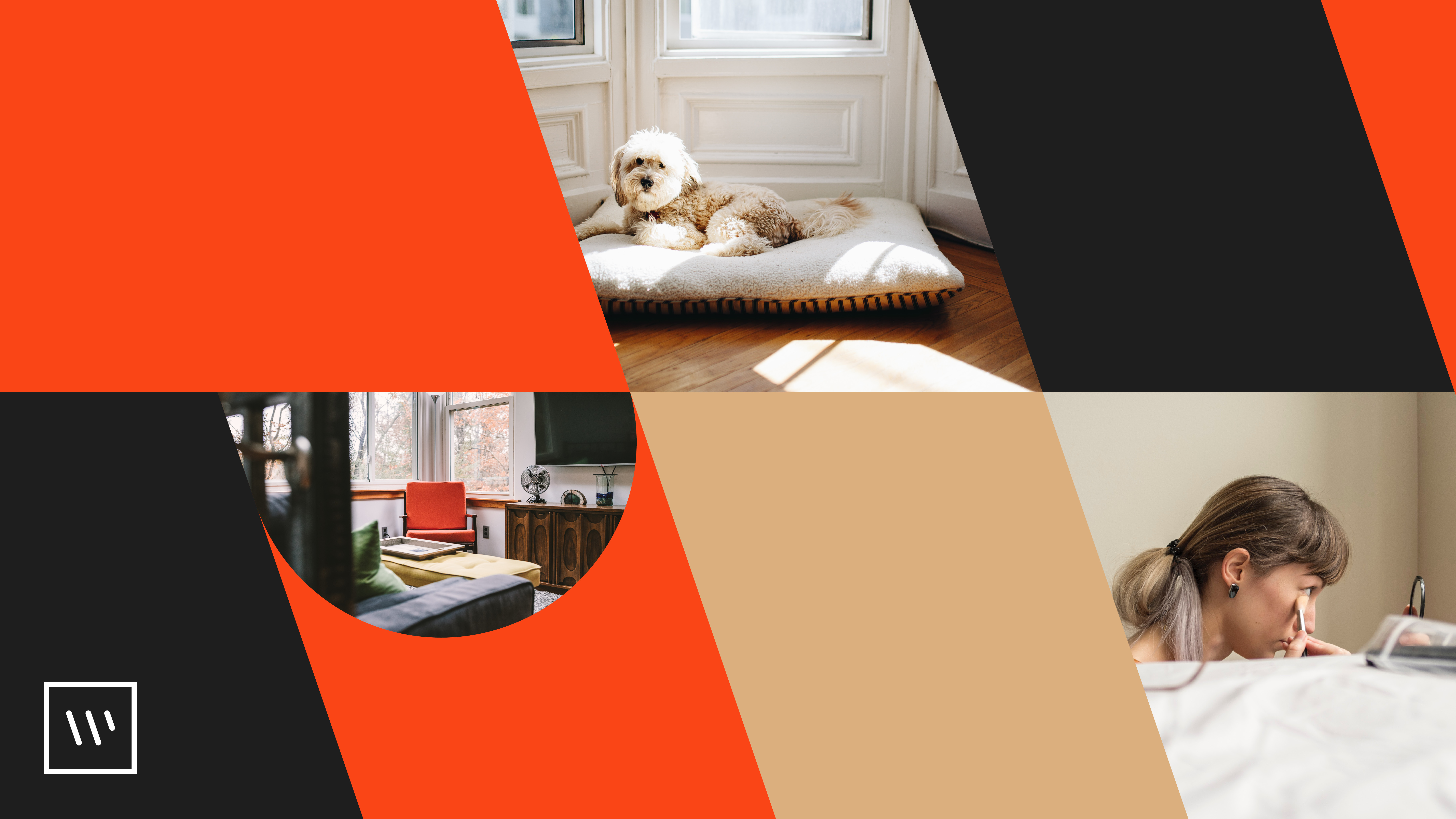
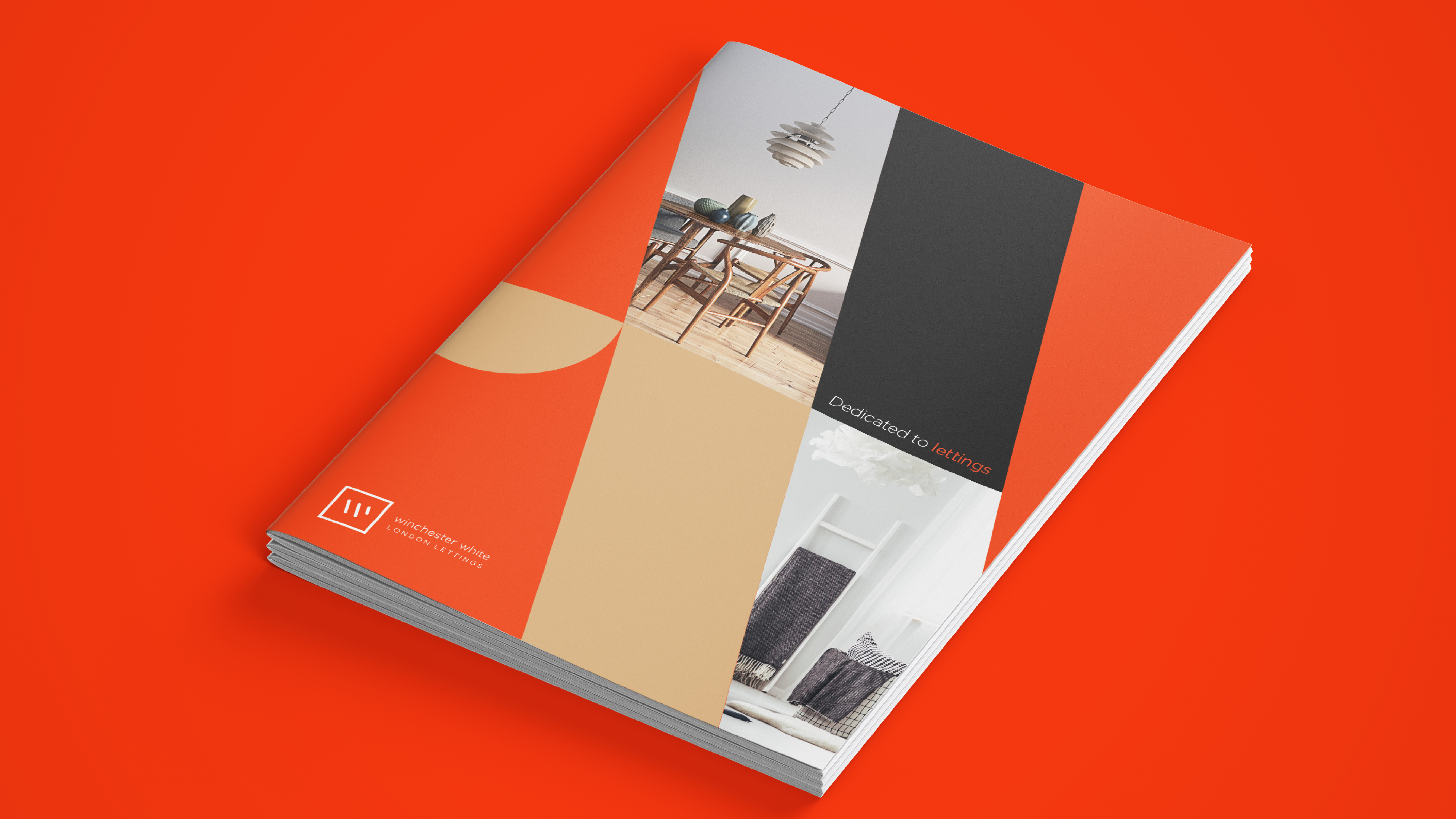
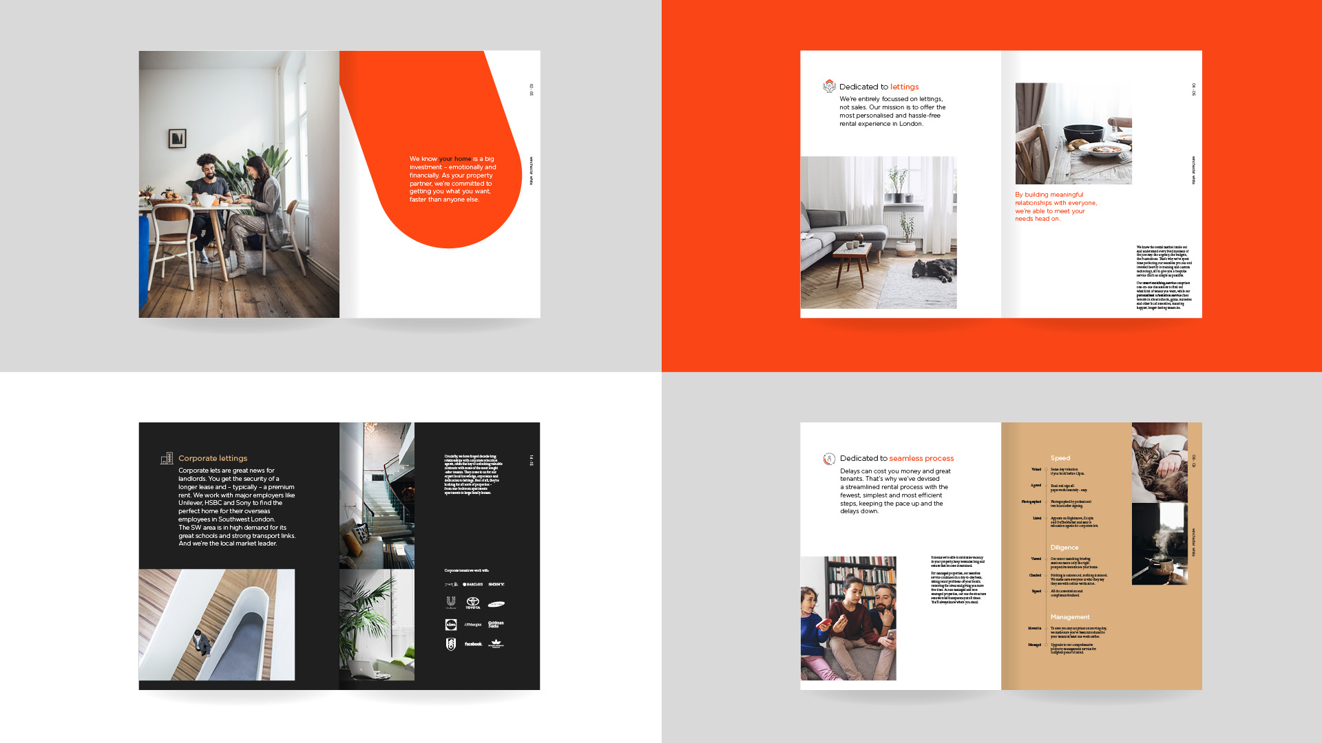
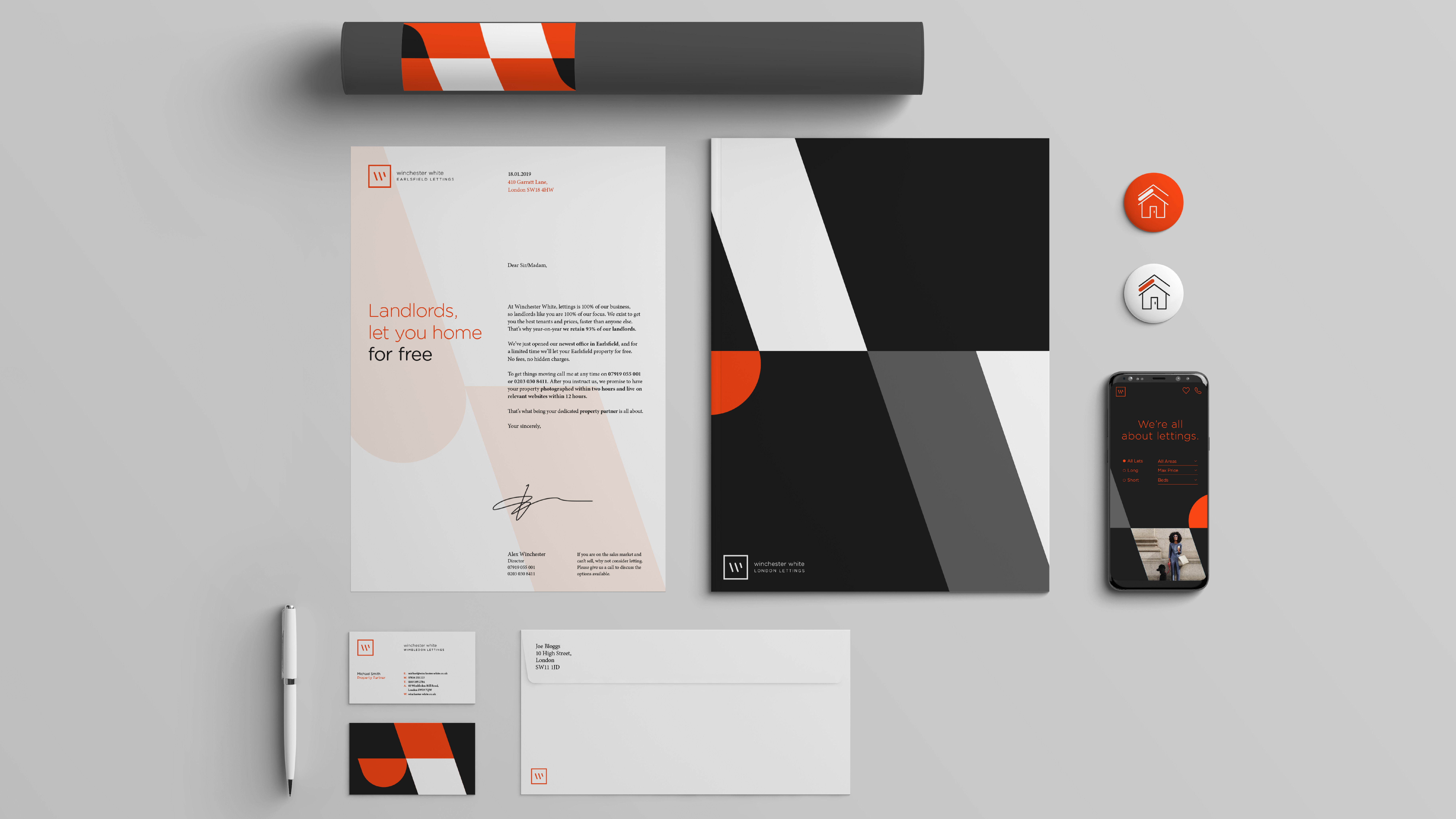
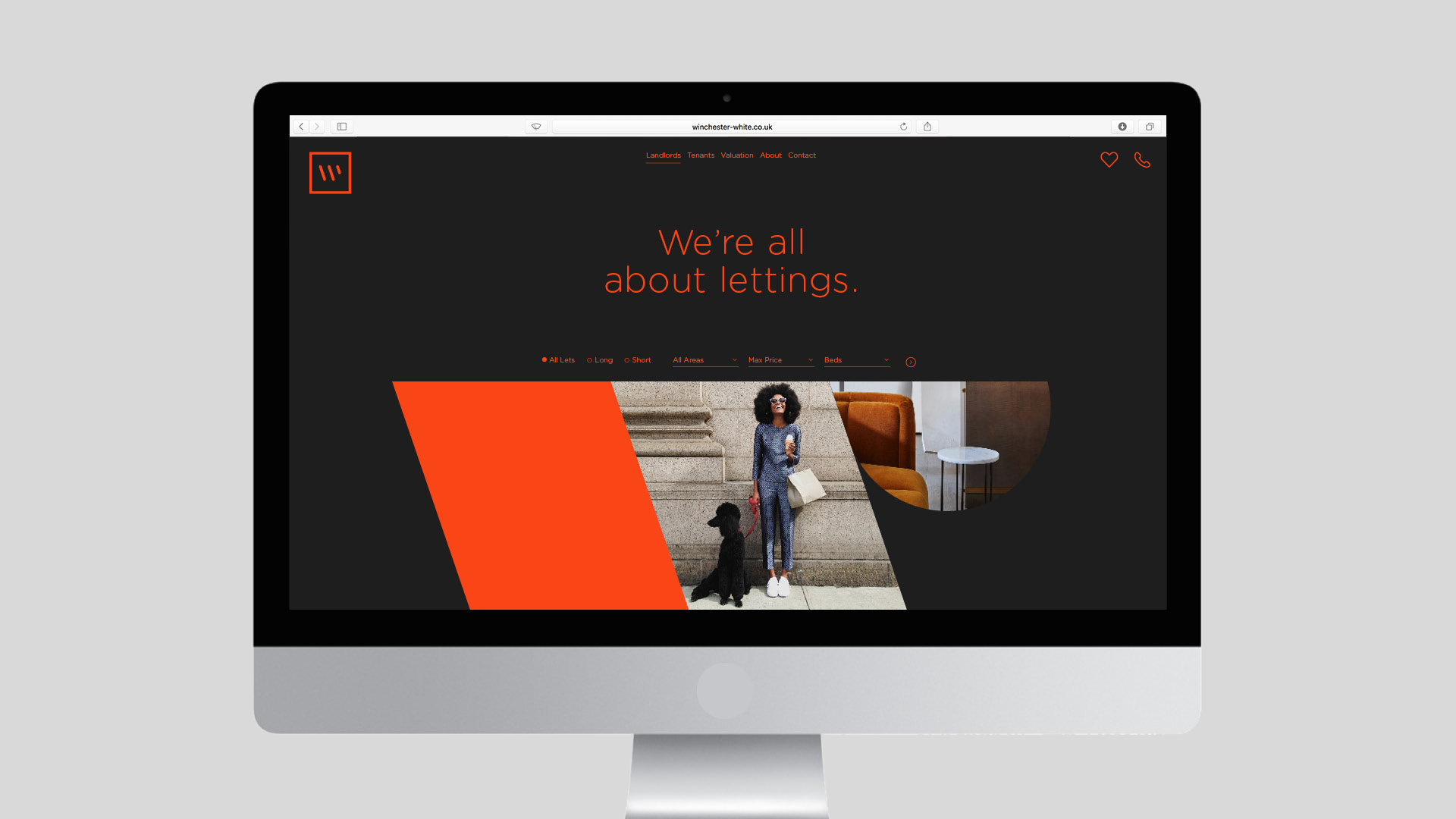
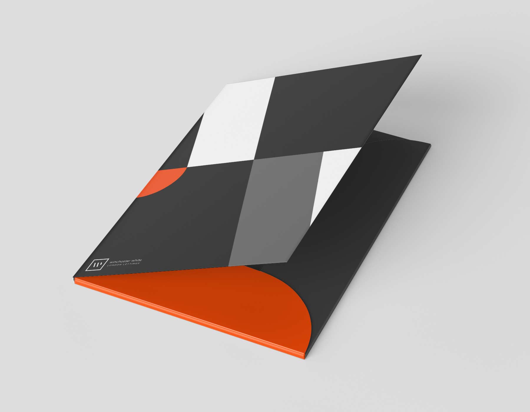
Winchester White is a letting agency based in south London. They wanted a visual identity, whilst keeping their existing logo. We took the shapes and angles of the brand mark and turned them into a flexible pattern that reflects the company’s flexibility and optimism. We used these shapes as a brand pattern, but also as lenses through which you can see the Winchester way of living.